If you prefer to listen rather than read, this blog is available as a podcast here. Or if you want to listen to just this post:
Many months ago I came across the website wtfhappenedin1971.com. The website is a collection of around 60 charts. All of the charts show some aspect of the modern world going haywire in 1971.
Some of the charts show that certain things were tightly connected for many decades before suddenly decoupling in 1971, with one thing continuing to go up while something else flatlined. An example of this would be compensation and productivity. Productivity continued to rise while compensation flattened off. Other charts show a single line that was trending more and more positive, up until 1971 when suddenly the trend flattened out. An example of this would be black income as a percentage of white income. Still other charts just show that things worked one way before 1971 and afterwards they started working another way. Examples in this category include global currency crashes but also incarceration, obesity and divorce rates.
As the last set of examples illustrates, while most of the charts deal with economic concerns, with particular emphasis on inequality and inflation, 1971 is also the inflection point for many of the other things we worry about, like political extremism. The two parties had been in pretty tight agreement for several decades, but in 1971 you see both start to veer off towards the extremes. After seeing dozens of inflection points, all occurring at the same point in time, one has no choice but to join the website in asking WTF happened in 1971?!?!
Unfortunately rather than just coming out and offering an explanation the website prefers to use something of a socratic method. They hope that the graphs will generate questions which will lead people to reach the correct conclusion on their own, and that the conclusion will have a better foundation because they arrived at it independently. However, if you make it all the way through the graphs there’s a link to a “Discussions” page which features some videos and podcast appearances by the guys behind the site. If you follow one of these links you’ll find that they blame it all on the end of the Bretton Woods system under Nixon. The biggest effect of this change was to end the gold standard. The 1971 guys think we should go back to a non-fiat currency system and in place of the gold standard we should have the bitcoin standard. I’m not sure what all or even most of the effects would be if the U.S. switched to backing their currency with bitcoin, but I can guarantee at least one effect. It would be very lucrative for early bitcoin investors, which is to say I’m not entirely sure we can count on these guys to be objective.
As I mentioned I came across the website several months ago, and at the time I made it the subject of one of my rare tweets (or perhaps I retweeted it, I forget which). In response some of my readers asked me to take a stab at answering the question. Of explaining what exactly did happen in 1971. Was it the end of the gold standard/Bretton Woods or was it something else? My curiosity had been piqued, and it seemed like something that might be in my wheelhouse. Accordingly in the months that followed I’ve been keeping my eyes open, on the lookout for evidence of big changes in the late 60’s early 70’s. Some grand explanation for WTF happened in 1971? Since that time here are the potential explanations I’ve come across:
1. I Was Born
It would be irresponsible of me to write a whole post on what happened in 1971, and not disclose that I was born in 1971. Perhaps the answer to: “WTF happened in 1971?” Is: “Jeremiah was born.” And of course if you’re going to have a Jeremiah he needs subjects for his jeremiads, so everything started going wrong the moment I was born.
Consider also that from a position of extreme solipsism I can’t even be sure that anyone other than me exists. Perhaps this reality is just my simulation and when I was born the creator of the simulation changed a bunch of the settings in order to craft the precise reality he wanted me to experience.
I’m not sure of a lot, but I am sure that we can’t rule out the possibility that it’s entirely my fault.
2. Nixon Ended the Bretton Woods System and the Ability to Convert Dollars to Gold
Next we might as well get the preferred explanation of the 1971 guys out of the way. For those that still aren’t sure exactly what happened, I don’t have the space to get into all the implications (and believe me, depending on who you listen to there are thousands of interpretations). But here’s the short description from Wikipedia:
On 15 August 1971, the United States unilaterally terminated convertibility of the US dollar to gold, effectively bringing the Bretton Woods system to an end and rendering the dollar a fiat currency. At the same time, many fixed currencies (such as the pound sterling) also became free-floating.
Certainly this is a big change to the way both the U.S. and the world economy operated. Also the timing does seem suspicious. Finally this is the explanation the website wants you to arrive at, which has to carry some weight.
While I only recently dived into the discussion section of the website and uncovered their fascination with bitcoin, the Bretton Woods angle was obvious just by looking at their charts, and one of the reasons I delayed writing about it is I wanted to better understand the linkage between going off of the gold standard and all of the things that had happened since then. And while I came across many other explanations for what happened in 1971 the “leaving Bretton Woods” explanation didn’t really get any clearer to me. And yes I understand that when you allow your currency to float freely ungrounded from any hard reality that it seems only logical that it would be easier to spend (government debt has exploded since 1971) and hard to keep the value stable (inflation has also skyrocketed). But despite this it’s rare to find even defenders of the gold standard claiming that we could ever go back to it. (Though such advocacy is becoming more common.)
I certainly understand the argument that the answer to “WTF happened in 1971?” Is, “We went off the gold standard”, but it feels too pat. It doesn’t explain everything else that inflected in 1971. It’s hard to find anyone arguing we should go back to the gold standard and even harder to find people saying we shouldn’t have left it in 1971. (Though if you have come across any great arguments please forward them.)
As far as moving to a bitcoin standard, tackling that would be a separate post, one I’m in no position to write just yet.
3. Nothing, there Was No Inflection Point in 1971
One of the big problems with the previous explanation and indeed all of the explanations is that there exists a reasonable possibility that despite all the charts nothing really changed in 1971. One of the points I’ve made before in this space is that anytime we talk about modern trends, we’re almost always dealing with very limited data. We didn’t really come up with the idea of tracking societal statistics until pretty recently. So when you’re looking at a graph charting the rise of real GDP per capita compared against median male income, the data for that graph was only collected starting after World War II. We don’t know what the comparison looks like before then.
This turns out to be a big issue. If we review the charts on the website, nearly half of them (27) only show data after World War II (with many not starting until 1960, and a few actually starting in 1970). If we were to divide the time since 1945 into two parts, the part before 1971 and the part after, two-thirds of that time has come after 1971. This makes it difficult to argue that the time before 1971 should act as some sort of “normal”, or control on our experiment, while the post 1971 period is the aberration. It seems just as, if not more likely, that the immediate postwar period — when the US stood alone as the only nation unscathed by the war, and furthermore at the peak of its power — was the aberration, and that the post 1971 period represents a return to normal.
Of course there is the other half of the graphs, the ones that go back farther than World War II, what about those?
Well the rest of the graphs are a mixed bag. There’s a fair amount of duplication particularly in the graphs showing the growth of federal spending and the debt. Of those that do go back farther back than World War II, most only go back as far as 1900 or maybe 1880. And some of those, particularly the ones dealing with inequality show that World War II and its immediate aftermath really did represent an aberration, that from 1900 to 1940 inequality was similar to what we’re seeing now. That 1971 wasn’t when things broke, it’s when things were “restored”. When inequality returned back to its usual level.
Related to the foregoing I should include a comment made in response to a post over at Astral Codex Ten. The post asserted, “Around 1970, something went wrong.” In response the commenter said:
This is semimythology. The richer the region within the U.S. you look at, the less growth there was between 1930 and 1970. The 1930s-early 1970s was mostly a process of poor regions catching up with the rich, not faster growth in the richest regions, which is what matters.
Combining these two explanations together I think we’ve gone a long way towards explaining what happened in 1971. But I don’t think they explain everything, and even if the postwar period was an aberration, it was apparently a particularly nice one, and it’s entirely reasonable to ask how we could return to those conditions, now that we know that it’s possible. Nevertheless I think it’s clear that at least in some respects the answer to the question of “WTF happened in 1971?” is that the auspicious conditions the U.S. had been enjoying since the end of the war finally came to an end.
4. The Long Peace Happened
As I mentioned many of the charts on wtfhappenedin1971.com concern rising inequality. This reminded me of the book The Great Leveler by Walter Scheidel, which I read and reviewed several years ago. Scheidel’s contention is that in normal times inequality is constantly increasing, that it’s only during times of great disruption that we get drops in inequality. Quoting from the book:
Thousands of years of history boil down to a simple truth: ever since the dawn of civilization, ongoing advances in economic capacity and state building favored growing inequality but did little if anything to bring it under control. Up to and including the Great Compression of 1914 to 1950, we are hard pressed to identify reasonably well attested and nontrivial reductions in material inequality that were not associated, one way or another, with violent shocks.
Scheidel then goes on to say:
State collapse served as a more reliable means of leveling, destroying disparities as hierarchies of wealth and power were swept away. Just as with mass mobilization wars and transformative revolutions, equalization was accompanied by great human misery and devastation, and the same applies to the most catastrophic epidemics: although the biggest pandemics leveled mightily, it is hard to think of a remedy to inequality that was dramatically worse than the disease. To a great extent, the scale of leveling used to be a function of the scale of violence: the more force was expended, the more leveling occured. Even though this is not an iron law—not all communist revolutions were particularly violent, for example, and not all mass warfare leveled—it may be as close as we can hope to get to a general premise. This is without any doubt an exceedingly bleak conclusion. (Emphasis mine)
This conclusion fits the data that shows that inequality was bad up until World War II and then started to get bad again a few decades later. But what about the rest of the charts? What about the other things that changed starting in 1971? To answer that, let’s turn to another book, The Worth of War by Benjamin Ginsberg, which I also reviewed several years ago. In this book Ginsberg points out that war is the ultimate test of rationality. When you’re experiencing a time of peace and prosperity, as we obviously are, then you can get away with doing things which are suboptimal. This is not the case when you’re involved in a fight to the death. In that case every dumb thing you do has a chance of opening you to the punishment of it being the last dumb thing you do. To put it in a milder form, we’re more tolerant of inefficiencies during times of peace than we are during times of war, and we have accumulated a lot of inefficiencies since 1971.
At best this would represent a partial explanation, and I know a lot of people would be inclined to deny that it should be extended even that far. Also the cure of re-engaging in existential warfare is almost guaranteed to be worse than whatever our post 1971 disease happens to be. Nevertheless this all touches on a larger point. One that I’ve made repeatedly in the past and which will come up again in this post. We’re in historically uncharted territory.
5. It’s All Part of a Historical Cycle
Peter Turchin, the leading proponent of historical cycles has gotten a lot of attention for predicting the unrest we’re currently seeing. His cycles have a period of 50 years, meaning the last period of unrest was in the late 60’s early 70’s but as I understand it spikes of unrest and violence bookend the different periods of expansion, stagflation, crisis and depression.
I am not a Turchin expert. I’ve read one book of his so far and it was entirely concerned with identifying historical cycles. It had nothing to say about what period we’re currently in, but if 2020 marks the transition between the stagflation period and the crisis period, and 1970 marked the transition from the period of expansion to the period of stagflation that would certainly seem to explain WTF happened in 1971. As I mentioned when I reviewed the last book, I do intend to read more Turchin. Perhaps I should start by following his blog? If anyone out there has been following it and can recommend any posts which bear on this as a potential explanation I’d be grateful.
6. We Broke The Country
As I’ve already alluded to, the late 60’s early 70’s certainly represented a political inflection point. Among the things that happened we have:
Extreme Violence: I’ve used this quote from FBI agent Max Noel before, “People have completely forgotten that in 1972 we had over nineteen hundred domestic bombings in the United States.” This is also suspicious timing, and while the violence itself might not have inaugurated the long standing trends we’re still seeing today, you could certainly imagine that in the face of that violence you might be willing to implement all sorts of changes. And while they might be in response to something which later goes away, the changes could prove harder to reverse.
Watergate: While Nixon didn’t resign until 1974 the actual break-in and the ensuing political circus happened in 1972. And since that time the ability of the government to get things done, particularly across party lines has steadily decreased. In particular while it’s easy to continue to spend money and kick the can down the road, it’s much harder and requires more coordination to exercise fiscal discipline. It’s hard to keep the train from driving off the cliff if you’re still fighting over the controls.
Roe v. Wade: Closely related to the above, this is when many people feel like the Supreme Court broke. And when I say many people I’m including Ruth Bader Ginsburg, who felt the decision represented judicial overreach and subsequently caused a lot of problems further down the road. Roe wasn’t decided until 1973, but it was argued in 1971.
The Age of Entitlement: In his book of the same name, which I reviewed last year, Christopher Caldwell makes the argument that the U.S. has two constitutions. The first, created in 1787, is the one we all think of when someone mentions the US Constitution. The second, created in 1964, and commonly called the Civil Rights Act, is not generally viewed as a constitution, but one of Caldwell’s central arguments is that it is, and that from this much of the current political landscape follows as a conflict between the original, de jure constitution, and the new de facto constitution. That, rather than being a natural extension of the original constitution, the Civil Rights Act is in fact a rival constitution, not complementary but actually opposed in most respects to the values of the original.
You may wonder how something which seems primarily cultural works to explain a phenomenon that’s largely financial, and moreover how something which happened in 1964 didn’t actually break things until 1971, but for Caldwell this is largely a financial argument. His claim is that passage of the Civil Rights Act opened up the floodgates of entitlement spending. While this spending was still in its infancy it was possible to imagine that things could be stopped or reversed, and indeed, that appeared to be the way things might be headed under Johnson, and even more so under Nixon, but Nixon ended up getting impeached. (I’m only now noticing the parallels between this description and the arc of Obamacare.)
This basically put the issue in the hands of Carter. Who actually tried to cut entitlements, and furthermore proposed lean and tight budgets. Whether his efforts contributed to the stagflation of the 70s or not, the timing of that was against him. All of this meant that by the time it got to Reagan entitlements were too entrenched to do anything about, and there was really only one thing he could do: Spend like crazy, cut taxes, and shift the burden of entitlements to future generations.
One could argue that 1971 comes into play because that’s basically the point at which entitlement spending passes from being contentious to part of the landscape. Which seems kind of a stretch, but at the same time it’s easy to imagine that a sense of entitlement combined with massive spending on entitlements could lead to many of the trends documented on the website. Similarly it’s also clear that we have been entirely unable to slow spending on entitlements, (indeed recently such spending has skyrocketed, see my last newsletter) which is why these trends have continued for so long.
Taken together these four political inflection points seem at least as much a symptom of an underlying disease rather than the disease itself, but it is interesting how many such inflection points were clustered right around 1971.
7. Decadence and the Twilight of America
Closely related to the previous point is the idea of decadence. This argument was recently put into book length form by Ross Douthat in his book The Decadent Society. I did a review of it back in March of last year, and I would direct you there for the full discussion. In this space I just want to see how well his arguments map to our 1971 timeline.
As is the case nearly every time someone makes an argument for modern decadence Douthat begins his tale with the moon landing. This is his very first paragraph:
The peak of human accomplishment and daring, the greatest single triumph of modern science and government and industry, the most extraordinary endeavor of the American age in modern history, occurred in late July in the year 1969, when a trio of human beings were catapulted up from the earth’s surface, where their fragile, sinful species had spent all its long millennia of conscious history, to stand and walk and leap upon the moon.
After that first historic landing we did it five more times. The last of those was December of 1972. If the moon landing represents peak America, then there’s a credible argument that 1971 was the summit of that peak. By 1973 we had withdrawn from Vietnam in embarrassing fashion. Which was also the year OPEC announced their oil embargo. Oil prices didn’t make it onto wtfhappenedin1971.com, but I found another site which pointed out that the early 70s was also when oil prices went from “stable to unstable and never looked back”. We also suffered blows to our prestige in areas like car manufacturing. By 1970 foreign car makers had started to flood the U.S. market with cheaper, more reliable cars. The big three responded by introducing more compact models, but none of them was very well regarded and to the extent people remember Gremlins, Pintos and Vegas it’s as punchlines to jokes. Compounding their problems they had to deal with numerous union/labor issues.
To put things in more general terms Douthat argues that decadence can be broken down into four different components:
The first is stagnation. In the book Douthat borrows a thought experiment from economist Robert Gordon. Where he asks people to choose between having no technology invented since 2002 or all current technology except indoor plumbing and toilets. Everyone always chooses the former. When I reviewed the book I speculated you could go back farther than 2002, and I wonder at what point you’d get 50 percent of the people saying I’d give up indoor plumbing rather than give up all the technology after year X. Is that year 1971? Almost certainly not, but I would bet that it’s in that general neighborhood if not actually earlier than 1971.
The second component of decadence according to Douthat is sterility. As in the fact that we’re literally not having kids. You want to take any guesses as to the last year the USA’s birthrate was above the replacement level of 2.1? Did you guess 1971? If so you get a gold star, because in yet another example of the 1971 inflection that is precisely the case. And it’s an inflection point I haven’t seen mentioned anywhere else.
The third component is sclerosis which Douthat mostly uses to cover political inaction. For most of us the filibuster has become emblematic of this inaction and indeed we see an inflection point in the early 70’s there as well. It got so bad so fast that in 1975 it was reduced from a 2/3rds majority to the current 60 votes we see today.
Finally there’s repetition, the stagnation of art and culture. Where, for example, a 2010’s movie looks like a 2000’s movie looks like a 1990’s movie. I think it would be very hard to pin the beginning of this to a specific year, and perhaps it’s the exception that proves the rule.
Once again we may be describing the symptom more than the disease, but taken in its entirety you can certainly see a narrative where around 1971 the US went from being vibrant and expansive to tentative and self-absorbed. Where we accomplished one final amazing thing — landing a man on the moon — and then there were no other frontiers left. Probably because I just read that book, it puts me in mind of Shackleton and the great British explorers, which of course coincided with the heights of the British Empire. I think to be vibrant a country needs a frontier or an enemy or something to strive for and perhaps in the early 70s after the moon landing and our defeat in Vietnam we had run out of both.
8. Less Likely but still Interesting contenders
So what’s my favorite explanation? It’s actually none of the above. And because it’s my favorite, it won’t appear here. I’m going to devote the whole of my next post to it. But before I end this post here are a few miscellaneous contenders:
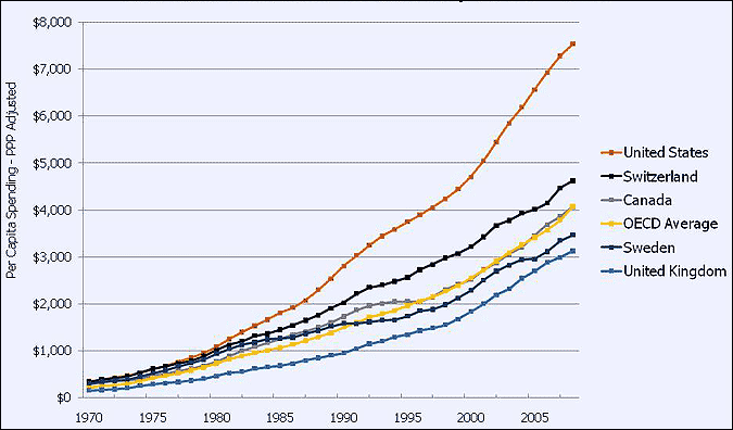
Healthcare: Another area that looks more like a symptom than a disease, but it’s easy enough to find graphs that show not only that we spent next to nothing on healthcare in 1971, but that we spent the same amount as other developed countries. That 1971 is when spending started to go up and to diverge from other developed nations.
Sexual Revolution: The timing is more or less right, and there are books that have made this case like Sex and Culture and Primal Screams. I doubt that it’s at the top of anyone’s list, but I suspect that the sexual revolution and other cultural changes have had a much greater impact than most people suspect.
Science broke: With the Wuhan lab leak hypothesis getting lots of attention, along with all of the things science did right and wrong over the last 18 months, added on top of the replication crisis, and the fight over climate change. Lots of people are asking if science is broken. If for the moment we assume that it is, then the next question would be when did it break? I haven’t dug into this as much as some other stuff, but one potential answer is 1971. That’s when peer review really took off, and it couldn’t have been too long after that that “publish or perish” became the law of professorship.
End of the Malthusian Cycle: If birthrates flatten and agriculture becomes more productive then we have reached a state in human development we very rarely see, a state where population is not limited by the food supply. This is not the first time this has happened, but previously it’s always been because of horrible catastrophes like the Black Death. The reason I didn’t give more space to the explanation is that it appears to have happened closer to 1960 than 1971, and other people have already spent quite a bit of time on it. But in essence one possible answer to the question of what happened is that after thousands and thousands of years humanity finally escaped the Malthusian trap.
Tune back next week when I cover my favorite explanation (hint: I’ll once again be talking about nuclear power.) There’s very little chance I won’t be back next week, but if you’re concerned at all, the best thing to do is to donate.
I think the problem with blaming Bretton Woods and departing from the gold standard is that it fails to account for why that happened. This is a clear example of something that was not some random decision few people thought much about at the time (say, like, having different fonts on computer screens) that ended up blowing up into major consequences. Instead there was huge pressure on Nixon and to solve it he left the gold standard. That begs the question of why there was such pressure?
I think one factor is that the gold standard has never been used in modern history. The last time was possibly the Spanish colonization of the Americas where money was literally gold coins. The gold standard means you show up with some gold at the central bank, give it to them, and they will print some dollars to give you in return and vice versa. If the US had massive exports, then gold would pile up in the central bank and lots of dollars would be printed. In reality during the gold standard eras, one nation would end up in the position to hoard gold and instead of printing lots of currency, they would just hang onto the gold.
One explanation I’m sympathetic too might be there is no real inflection. Another one is settling down to modern society. Imagine a 20 year old in 1935. By 1971 he would be 36 years older and nearing 60. The older men who created the modern world (FDR, the New Deal, Truman) would be dead. He would be the generation that knew the founders but is now nearing his peak influence and his children are inheriting a world system (roads, electricity, TV, Social Security, Unemployment Insurance, even labor unions that are institutions rather than semi-outlaw Antifa lilke organizations) that are established and part of the normal world. Perhaps in America at least this was the transition of the modern world from its adolescent stage into the adult stage and the divergences are the result of that normality. Like your transition post college from partying every night to making mortgage payments and waking up on time.
I also think, though that the real kicker comes about ¾ of the way down the page. “Energy and real GDP per capita”. Between 1960 and 1971ish, it seems energy use per person and GDP per person rose more or less in sync. Afterwards GDP per person rose but energy use has remained the same. Before more income meant more stuff. You brought your family its first refrigerator, TV, washing machine, and of course car. Maybe you are buying a 2nd car in 1970 so your wife does not have to wait for you to get home to go somewhere. More stuff = more energy. Nuclear power, fusion, robots are all well and good but it takes energy to mine stuff, machine it, and put it together to have your second car. Do you want a third car? A fourth?
After 1971 we started to get GDP growth without using more energy. Maybe we started getting more elaborate haircuts (see 1980s) or started spending more time with psychotherapists, but we ended up with more money but less willingness to buy physical stuff with it. To me that feels like it has a lot of knock on effects like dramatically increasing the financial markets, which also increase debts because financial markets are ultimately about trading debt.
What did you do when you were a kid and got a boatload of money somehow from mom and dad? Movies and arcade probably. How much production/energy was that? Almost nothing. The projector takes the same amount of electricity whether the theater is full or half full. Your energy consumption was probably mostly from whoever drove you to the mall. Today what happens if your kids steal your credit card? You’re charged for a bunch of ‘skins’ for them to use on Fortnight. A good amount of our activity as humans has moved from the physical to the socially constructed and 1971 is probably as good a date as any to start that.
In some respects I feel guilty for not previewing my favorite explanation, which is the next post, because it caused you to waste a lot of your time unnecessarily. On the other hand it’s nice that we independently arrived at the same conclusion. Yes, my favorite explanation is also the productivity/energy disconnect.
Ahhhh we are at a draw. But if you want the win you’ll have to explain how the 2009 movie Watchmen ties into all of this demonstrating potentially soul shattering ideas. Only then can you claim the title of master.
“Scheidel’s contention is that in normal times inequality is constantly increasing, that it’s only during times of great disruption that we get drops in inequality. Quoting from the book:”
Reading a book now on developing economies written back in 2011 (a lifetime ago but interesting to see how short term views were vindicated or ruined). One aspect is poor countries often generate large amounts of growth because it is simply the case if people have $100 per year, then to get 10% growth you just need $10 more per person. Smaller base.
I sense this works in reverse as well. Large drops in inequality happen in great disasters because if you destroy a lot of stuff, the people with the most stuff will lose the most. One nuke for each of the ten richest cities around the world would lower inequality. The fall of Rome was bad for the rich because if you are rich, a large working empire with reliable roads, a system of law, and complex culture works for you.
However, it doesn’t follow from that observation that increasing inequality is a good thing or that any time inequality falls (say from certain policies) is a bad thing. Simple example, home ownership in the US has been a check on inequality. Asian nations that grew rapidly after WWII did so by breaking up large landlords esp. in agriculture. No evidence that that was destructive.
Where I go with this, if you happen to see a decrease in inequality, it is quite possible zombies or comet impact has happened and that’s a bad thing. It’s also possible nothing bad happened.
I think there are very few people that argue falling inequality is bad. I think most people think inequality is bad and destabilizing, and all Scheidel is doing is agreeing and adding, “unfortunately it’s almost impossible to fix absent something even worse”.
Did not inequality fall after the Great Depression? The Depression itself was a bad thing but it was not a program to reduce inequality, some could argue inequality itself produced it. The New Deal and WWII seemed to usher in both anti-inequality policies and an era of positive growth.
On a smaller scale I recall the breakup of Standard OIl left individual oil companies that collectively performed better than the former united company. Rockerfeller had fought vigerously against a policy that in the end probably made him richer than he otherwise would have been. Humans might have a bias towards size or unity (“I want to be the only company in this space”) that blinds them to when that costs more than it gains.
A few concerns the site’s presentation of data from a methodological standpoint:
1. It’s easy to fall victim to selection bias with this approach. Obviously the site is doing a lot of motivated reasoning. The people putting together these graphs are going to ignore anything that doesn’t match the hypothesis “something happened in 1971”. Given enough graphs, I could support a hypothesis of “something happened in 19XX” for just about any year last century, so long as I cherry-pick a few dozen examples – and there is clearly a LOT of cherry-picking going on here. A site like this is far from a ‘full data set’, which makes me extremely skeptical that this is anything like a representative sample of what the full data set might look like.
2. I noticed they used inflation-adjusted numbers in a lot of graphs, which is good. But they aren’t consistent on that, with a number of graphs that don’t adjust for inflation. (I’m not talking about the percentage graphs, which obviously don’t need to be adjusted.) This gives the impression that the data are stronger than they are. Indeed, they seem to know this, because they start with real-GDP and other inflation-adjusted numbers, but shift away from that later on down. This gives the impression of rigor without having to actually deliver that rigor later when the audience is less focused on the details. Maybe it’s not intentionally deceptive, but if they had intended to hide the strength of their case this is how they would do it.
3. Many of these graphs represent non-linear trends, but they’re still graphed on a linear scale. This will tend to bias the analysis, because more recent information will look dramatic – even if the less recent information was as dramatic at the time it happened. For example, if I give you a penny and promise to double your money every 20 minutes for the next 24 hours, the graph of your net worth will look like it has flatlined for the first 23 hours, then suddenly spiked. This despite the fact that you became a millionaire 9 hours in, despite having less than $6 a mere 6 hours before then. In the same way, a trend that looks like it flatlined back in the 1920’s may actually represent a major increase in context of the time. The only way to demonstrate that a real change has taken place is to use a logarithmic y-axis to represent the data.
4. If you gave this series of graphs to a random sampling of people and asked them to pick a specific date to focus on, would they really pick 1971? They helpfully marked that year on all the graphs, but without that date on there, a lot of these graphs look like trends that started 5-10 years before or after their proposed 1971 date. This is a big problem for their proposed causation mechanism, and slapping a red arrow on the graph doesn’t fix the issue, it only hides it. Using this methodology, you could come up with a number of different explanations – pinning the date around a decade (or more) possible inciting events. That gives us much less confidence that their just-so story has any explanatory merit. Combine it with my first concern, and you could potentially assemble a website like this for any date in the last 150 years or so (depending on how many charts you can assemble), asking “WTF happened?” Bad data analysis, sorry.
5. Speaking of all those ‘helpful’ markings all over the graphs. I don’t agree with a lot of them. They put a line on the graph as if to say, “this line marks when this trend begins and ends”, but those lines were put there by man, not by God. (Certainly not by math or by some consistent methodology.) It’s one thing to apply a trend line to your data. It’s another thing entirely to add a big fat clipart arrow onto your graph and label it “fast progress”, and “slow or no progress”. There are ways of doing this that are mathematically rigorous and effective. This is not how that’s done – and for good reason! This way is how you deceive yourself into thinking you see signal in the noise.
Okay…
How could they re-do this to make it right? They could take a 7-year rolling average of the data for each graph; then if they want to know whether there is a trend, they could define that as the derivative of the original graph; they could then define acceleration of a trend as the second derivative (a changing trend). They could define the point where the graph crosses the x-axis as an approximate date when the inflection point happens. Having pre-defined parameters, they should then pre-define the data set they wish to explore, then post ALL the results of their analysis. What they shouldn’t do is eyeball the graphs that look close, then mark all over them based on motivated reasoning and an ax to grind. Indeed, if they wanted rigor, they’d have to take someone who hasn’t looked at the website and have them choose economic indicators in advance that they think would accurately test the hypothesis. I guarantee they won’t cherry pick median house prices in Boston and New York as one of their metrics. Not without including Chicago, Atlanta, etc.
None of this is to say their hypothesis is necessarily wrong, just because they followed all the worst practices in data manipulation. It’s just to say that I feel no compulsion to even engage with the hypothesis, because there’s nothing real behind it. This is exactly how you fool yourself into thinking you’ve found something in a data set when there’s nothing there. People will always be able to look at a cloud and see an elephant, or a mouse. Just as they’ll always be able to look at a cloud of random noise and see a clear signal that ‘has’ to be true.
The best thing to learn from this website is how to spot a fake.
Very astute commentary, though I think in general I tend to be more forgiving than you. Yes they were sloppy, but no I don’t think you could make the same case for any year. Which is to say I’m willing to bet that if I rolled a random number between 1900 and 1999 and then you took that year and assembled graphs and marked them up and then we took some random people who had never encountered the 1971 site and showed them those graphs and your graphs that more people would choose 1971 as the year something happened, than your set of graphs. Now what does this prove? Very little. But when you’re dealing with trying to extract inflection points and trends out of history, I’m inclined to be somewhat more forgiving because the difficulties are so great. It’s like when I reviewed Turchin’s book:
“The key problem with any theory like Turchin’s which attempts to predict the future by drawing on what happened in the past — deriving trends or cycles or general rules — is that it’s very difficult to make it even approach science. You have no control group to compare against. There’s no way to account for the effects of new technology. And your sample size is tiny. Turchin’s sample size is eight, or four if you only count the nations, and it was the work of hundreds of people and decades of research to compile the information necessary for even this small sample. So you’re faced with a situation where making a case is fantastically difficult and the case you can make isn’t very scientific even if you do go to the effort.
Within the context of these limitations, I don’t think it’s possible to do a better job of making a case than Turchin has. He has pulled in data from several different angles. It’s full of charts, statistics and comparisons. He’s applied his theory successfully to multiple nations, in multiple different settings and historical periods. So, If you’re willing to at least entertain the idea that it’s possible to predict the future by looking at the past, then Turchin has done everything that might be expected towards making such a prediction. I understand he still may be wrong, that he has “proved” nothing, but it’s hard to imagine a more serious attempt than Turchin’s.”
Now to be clear Turchin’s attempt was better than these guys, but I think if we followed your methodology there is useful historical information that would get tossed because it wasn’t rigorous enough.
I suspect you cannot make graphs showing any arbitrary year will mark the start of some dramatic trend. I am willing to bet many years are boring and many of these graphs are not obscure economic series but pretty important ones. I do think, though, that if you shifted through the data enough, you could come up with multiple years where “everything started to change”. In this case it would be like the guy who found the first prime number feeling like he has something really special, only to realize later on that there are an infinite number of primes, but they are rare among numbers nonetheless.
I majored in economics many years ago and there is a set of ideas premised on cycles of various length nested on top of each other (see Kondratiev waves ). A professor I liked who was very mathematically inclined, however, told me he had shown they aren’t in the data as part of his Phd. Not sure what to make of that ‘proof’ though.
I’m going to have to hard-line disagree with this analysis. There’s a difference between, “okay they weren’t rigorous enough, but you don’t have to squint to see there’s a signal there,” and what these guys are doing.
From a philosophy of science perspective, they consistently made decisions you only make when you’re about to fool yourself into seeing signal in the noise. Having seen this many times, I have strong confidence that this doesn’t represent signal and is almost certainly noise. If they had a good case to make, they wouldn’t have had to resort to these contrivances.
You’re right that the past is an experiment with n=1, but that doesn’t mean our approach to historical trend spotting should be to shrug our shoulders and accept any analysis regardless of whether the methodology is designed to produce wildly inaccurate results. Instead, we should be more careful, knowing we might spend a lot of effort on something that was never real. We should certainly not deceive ourselves.
You’re also right that rigor will necessarily cause us to miss some faint signals in the noise. But the fundamental truth is that there’s much more noise than signal. Many orders of magnitude more. If you’re running a low-rigor analysis and you think you’ve got signal, the chances are highly unlikely that you do. Something like this 1971 analysis is even less likely to be real.
As we loosen our standards, we waste time thinking we’re learning something when we’re really only trying to make sense of static. You don’t learn anything by listening harder to a poorly tuned device. You have to be willing to tune your receiver and filter out all the noise to learn anything new.
Possibly we’re talking past each other, let me try to make it more simple:
1- Inaction and action both carry consequences.
2- What information can we rely on to decide between the two?
Your answer would appear to be we can only rely on information that meets a certain standard of rigor (from what I can tell it’s a pretty high standard).
If we can’t assemble information of sufficient rigor do we default to inaction?
If inaction was always safe, then this course of action would be perfectly acceptable, but my argument would be that inaction is not always safe, and that there is information out there which can enable us to choose the right course more often than not which nevertheless doesn’t meet your standard of rigor, and if we reject it based on it’s lack of rigor we will end up with worse outcomes than if we didn’t.
Let’s say there are two courses of decision we could take, but they’re not action/inaction. Rather, the two possible decisions are:
1. Gather more data
2. Take action
You seem to be arguing that I’m asking for too much rigor – in essence, to continue gathering data ad infinitum. I think that’s a valid question to ask. There’s always more rigor we can pursue, and it can get in the way. But there’s also a lower-bound threshold beneath which we would be foolish to take action. I’m arguing that a site like WTF 1971 falls so far below the threshold that it would be laughable if we decided to take action based on data so poor.
Let’s clarify this a little, and make it less situationally specific. Let’s say there’s a potential that we made SOME historical error of judgement, and we need to determine what that is in order to take action. We might go on gathering data forever well beyond the point where we should have taken action, unless we have some standard for moving from #1 to #2. But how do we know when we’ve passed the threshold and should change tactics?
I would use the airplane analogy. Imagine we’re in an airplane. We need to know where we’re going before we take off, in order to know whether we have a hope of ending up in the right place. We might be able to spot something large (like a city) from up in the air if we get close enough. But if we don’t know anything, taking off is a waste. We’re not only unlikely to find our target from random chance, but we’re also wasting time and resources we could be using to find the target.
Say we know we’re looking for Berlin, but we don’t know where on the globe we’re starting from. We should obviously NOT take off. Say instead that we know we’re in West Germany, and Berlin is about 50 miles due east, +/- 2 degrees and +/-2 miles. Given the size of Berlin (radius >5 mi), we’re almost certain to hit our target given these bearings. At this point, the time for gathering data has passed, and the time for action has commenced. We could wait until we can pinpoint the Brandenburg gate, but we have more than enough precision already to pursue our goal.
I think your perception is that the 1971 site is more like the West Germany example. After all, you’re not going in completely blind, right? All the data point in the right direction, and maybe the gold standard isn’t the problem, but it’s clear there’s SOME signal there, so you should go after it.
My perception is that the kind of data assembly they’re engaged in is the equivalent of listening to the town drunk give you directions. He barely even knows his own name, let alone which direction Berlin is. Listening to him is worse than picking at random, because at least with a random pick you haven’t fooled yourself into thinking you know something.
You’re looking down through the clouds and you see a city. You think it’s Berlin, but it’s as likely you’re looking at Memphis. You think you’re going somewhere important, but really you have no idea where you are. If you have to take action, don’t fool yourself with bad data.
I would also argue that sometimes taking action IS dangerous. And that it’s more likely to be dangerous if the action we take is founded on false premises, and bolstered by bad data. This kind of action can:
– distract us from focusing on real problems, or figuring out what those are
– take resources that might otherwise be used to combat future crises
– destroy our credibility and therefore ability to identify a crisis
That last point is probably not a bad thing. Indeed, it seems like it’s deserved. But since successive generations of potential problem solvers can come and go, each destroying their credibility in turn, it’s not a strategy for success to just cycle through people, identifying false threat after false threat. Especially when there are real threats out there that need to be addressed sooner than later. We should instead have a solid plan for how to identify real problems and solve them.
We should minimize risk and improve safety based on sound principles. Not based on the fear that doing nothing will potentially end in catastrophe.
I don’t think your airplane analogy is very good at all because it embeds a precision that doesn’t exist at all in the real world with people making real decisions. As an example let’s take Nixon’s decision in 1971 to go off the Gold Standard, and end Bretton Woods. You’ve essentially argued, that even today we can’t tell what effect that had on the economy, the country or the world. So how was Nixon supposed to make that decision. Certainly he couldn’t rely on scientific rigor to guide him, gathering more data was useless. As a result he would never pass from 1 to 2, he would never act. And yet there are a lot of people who claim that he had to do it. It seems unlikely that their claims met your standard for rigor, so would be be condemned to never act?
This is the problem, gather more data is very useful for finding a city, and a city is in a definite place, but so many of the problems our society face present no easy methods for gathering data. For example the recent increase in murders, was in the pandemic, was it a second order effect of BLM, is it something the police are doing related to the first two or entirely unrelated. What should we be doing? Are you perhaps suggesting that in the absence of rigorous data that we should do nothing while people die? Or are you suggesting that the data is so bad that it points to no clear conclusion and we should instead pick from the options randomly.
I’m suggesting that the larger problem is a failure mode of society, where we collect a lot of bad data and pretend it can substitute for good data. The attitude that “we have to do something” has resulted in decades of guess-and-check failed policy, where we were SURE [X] was the driving factor behind [Y], only the reality intervened and the problem got worse.
Then because we continue to ignore rigor, one side claims it’s because [Y] was already getting worse, and would have been catastrophic except [X] saved us. Then the other side claims the opposite and that we’d have reached nirvana if only we’d have abandoned [X]. We pour increasing amounts of resources into never getting closer to finding real solutions to our problems, all while getting angrier at one another for not accepting our side’s low-rigor data set.
My perception is not that we have a lot of people at a loss for what to do, because they’re trying too hard to get better data. It’s that we have all sorts of ‘solutions’ that proponents have fooled themselves into believing can’t possibly be false. So when they design their remedies they take little thought for rigor and we keep circling the same shallow well of failed solutions to try and solve our problems.
I’d prefer one effective solution to decades of back-and-forth bickering about which non-solution we should pour more resources into. At this point I’d settle for finally rejecting a few hypotheses that we can never quite get away from. That almost feels like progress. If we hand the world off to our children with the same problems (only worse) and no new insights into how to solve them except what the last generation handed us, we’re kicking the can of human suffering that much farther down the road. Hoping technology truly can save us, maybe? There has been too much learning without coming any closer to the truth.
Okay, I think your position is clearer now, and I would certainly agree that a certain percentage of decisions are made in haste, with crappy data, and it would have been better to do nothing and wait for better data. That this is, as you say, a failure mode, and one that we should have gotten better at avoiding. But how big is that percentage? How many decisions truly fall into this category. I agree it’s not 0%, but its definitely not 100% and I would argue that it’s far closer to the former end of the distribution than the latter.
“As an example let’s take Nixon’s decision in 1971 to go off the Gold Standard, and end Bretton Woods. You’ve essentially argued, that even today we can’t tell what effect that had on the economy, the country or the world. So how was Nixon supposed to make that decision.”
So in my mind I’m envisioning a node on a network type graph. 1971 stay on Standard or go off standard is where the node breaks in two. From there you’ll see a huge number of future breaks and the original two branches break into massive trees where outcomes range everywhere from near utopia to total extinction. Also I suspect much of the space will overlap.
In other words, the decision almost certainly doesn’t matter at this point. Just like tossing a pebble in a pond and returning a day later, you’re not going to see any difference.
You have to consider if you made a decision in 1971, you’ve had zillions of decisions since then and each one of those decisions will be a reaction to feedback you’re getting. It isn’t going to be very long before the feedback you are receiving is going to be more from your post-1971 decision than the one decision you made in 1971.
I think the mental model we are crafting here is a bit deceptive. It seems to amount to sleeping all the time and waking up only to make critical decisions. George Bush I think wrote a book called something like Decision Points premised on this very idea…..except here the decision point may not even be obviously important like whether or not to go to war.
I think it is undeniably important that the decisions made for the 50 years after 1971 collectively have much more weight on the way the world looks today than any decision made in 1971….or for that matter *every* decision made in 1971.
I can’t agree more with what Boonton said here. There’s this illusion that we need to find the one or two critical levers and we’ll be able to move the world. But that’s not how complex systems work. And especially when we see a system that tends toward stability/consistency, those systems seldom driven by even simple combinations of factors. Instead, they’re prone to drift over time, as individual factors react to and compete with one another.
The likely answer to why the world looks the way it does isn’t that there’s some small effect that nobody has noticed creating enormous downstream impacts. It’s that researchers don’t yet have a sufficient theoretical understanding of network theory and complex systems analysis. In short, it’s all hidden beneath the noise. Simple statistical analysis isn’t even designed to detect that kind of effect, buried beneath a thick layer of noise.
I think you and Boonton have gotten the wrong impression. I’m not saying that the possibilities I’ve listed for what happened in 1971 represent lever’s. I’m arguing that they represent sources of complexity with the potential to have complicated things enough to see the divergences we’re witnessing.
Yes it would be nice if we could have avoided introducing these new sources of complexity (that’s what the Amish did) and avoided some of the bad things which have happened since 1971, but that was never something I was pushing for.
What I’m trying to get at ultimately is the importance of identifying sources of complexity and attempting to mitigate the number of negative black swans they spin off. Progress does have a certain unstoppable quality to it, but can we implement it a little more slowly? Or in only a few states rather than the entire country all at once? Can we be more accepting of people who’d rather not introduce this new source of complexity? In some cases the answer is no, in other cases the answer is ye.
To make it less contentious let’s wind it all the way back. They think horses were domesticated sometime around 5500 BC. Let’s say we could pinpoint the year, say 5571 BC. Even if we don’t accept the theory that the horse underpinned the culture of the Proto-Indo Europeans, and led to their domination of most of Eurasia, we still have all of the other benefits of equine domestication. Given that, would it be useful to ask WTF Happened in 5571? And if someone came up with the answer the horse was first domesticated would that be useful information for dealing with the world in the centuries that followed? I’m not arguing we should have stopped this domestication, I’m just arguing that it’s certainly helpful to recognize that it was a big deal.
The big question, though, is did anything get more complex? Amish society is not simple. Riding domesticated horses is probably as complicated as managing a car payment.
To use a more modern example, I think the acceptance of gay and bi people in society with gay marraige added some elements of complication but it also took away others such as a measured degree of hypocrisy that society maintained. For example, isn’t it less complicated to just have gay people serve in the military openly without discrimination than to maintain ‘don’t ask don’t tell’? Complexity wise I suspect it is more or less a wash.
We’re still talking past each other.
This whole time I’ve been saying the same thing: WTF 1971 are clearly trying to test a hypothesis using bad data. They’re fooling themselves. But you’re also fooling yourself if you think you can generate a hypothesis on a mountain of bad data.
There’s this tendency to think that a bunch of bad data pointing in the same direction has to add up to at least a little good data. It’s can’t all be wrong, can it? You’d be surprised how much farther down the rabbit hole you can go chasing a whole lot of nothing, using the techniques these people employ. You could easily go your whole life – and more – believing you’ve discovered something when all you’re doing is explaining noise. And people have!
Frenology, Lysenkoism, four humors, epicycles, etc. These are the poster children, but the graveyard of rejected theories people maintained for far too long is bigger than you think. If you look at these charts and think there must be something there (even if you don’t buy the gold standard story), you don’t realize you’re buying into a long and ignominious tradition.
And it’s not like this is something people used to do all the time but we’ve largely abandoned. People are still doing this garbage today, and with frustrating regulatory. Just look at the so-called Universal Model. Same bad science, same dead end. You asked a few comments back whether I think it is likely real that SOMETHING happened in this timespan on a % scale? Low single digits, if that.
I looked at the same data set you did and I’m entirely unconvinced that ANYTHING significant happened in 1971 or thereabout. If you want to convince me that you’re seeing something here, you need more than motivated reasoning, ridiculously cherry-picked graphs, massive y-axis scale manipulation, and every other trick in the data manipulation playbook. Indeed, if the case was so clear, why do they need to fake it so hard?
There’s a difference between something that’s low rigor and something like this. Low rigor might be enough to generate a hypothesis. Or maybe the researchers didn’t think of all the angles, so there are a few holes they need to fill in to generate more confidence.
That’s not what this is. WTF1971 is not otherwise good data, but a few quibbles here and there. It’s so bad it’s a waste of time to discuss for anything other than its merit in demonstrating exactly how people manipulate others into thinking – without any real evidence – anything fanciful thing.
I meant to give this a longer response and before now, but things have conspired against me. So I’ll try to get a few quick points out.
Rather than focusing on the whole yarn on the wall connections they’re trying to make let’s just focus on the very first graph of the divergence of compensation and productivity. Is this graph by itself worthless? If so why? Is it bad data? is it not a long enough time horizon? If it’s not a long enough time horizon are you expecting the direction of the lines to be unknowable going forward or are you expecting a convergence? If so what force wants to return to equilibrium? If it’s still unknowable what the trend is after 45 years how many more years would they collect data for?
If this chart is good for something what is it good for? Does it allow us to say something with any degree of confidence? If so is it just the scope of the WTF1971 claim that bothers you?
And my other question remains unanswered. How would you make a decision on issues such as these if you had to? If you were Bush/Obama in 2007-2008 would you have passed TARP? If so why not? Do you just have a philosophy of inaction or is there something beyond that to your ideology? Do you disagree with government intervention in general? What about all the questions the CDC had to grapple with at the beginning of the pandemic? Certainly rigor was in short supply, how would you have made policy during those first few months?
If I was Bush in 2008 (TARP was passed an implemented by Bush, the campaign was going but Obama was not a player in it except for later on when he allowed what was left of it to be used for the auto bailout), I would support TARP.
However, my thinking about important decisions holds that a decision is only important if it has unique outcomes that could not come from making other decisions. For example, one consequence of TARP was the financial system didn’t seize up. I suspect that outcome could have happened through numerous other policies. For example, an Andrew Yang style $10,000 to every American wouldn’t have helped financial firms with bad assets very much, but would have provided lots of opportunities for financial firms handling deposits (and also some assets wouldn’t have collapsed as getting $10K in your pocket in 2008 could have helped you pull your house out of foreclosure).
In other words, the only important thing about TARP may be that today Wells Fargo is still a major bank. In an alternative world it might have gone bankrupt and is now subsumed by JP Morgan or some other bank that arose.
I suppose the real question is was doing something drastic like TARP important or not? An Austrian economist might say after a period of collapse, the financial system would have bounced back and we’d be where we are today or perhaps even better (minus Wells Fargo). If things would have been better, then that’s a place TARP couldn’t get us too making it important. But then perhaps a tweaked TARP could have also gotten us there so it doesn’t necessarily rule out ‘drastic’ decisions.
Maybe the discussion between you and Mark might be resolving around did something important happen in 1971, did something important only become noticeable in 1971 or is it bad data and if you really wanted you could come up with an equal number of graphs that also seem to imply plenty of other years, maybe every year, was some pivotal point?
In the middle option, another way of restating that is to say the first derivative of something changed at some point prior to 1971 but 1971 was the year when the function crossed from positive to negative, or a line that had been above another went below etc. In that case the actual ‘interesting year’ would be when that change in the first derivative happened, 1971 was only interesting as it started to get noticeable.
1. Productivity vs. Hourly Compensation: Here again we see them hiding evidence behind modified graphs. I’d like to see the direct graph of real wages measured against productivity, as opposed to the growth graphs. In my experience, you often see these derivative graphs hiding a lackluster substantive difference. In a journal club, when we saw something like this we’d go back and look at the direct data. Invariably it would not be impressive. We’d call the analysis, “statistically significant, but biologically meaningless”. (We were biologists, so you could replace this with ‘economically’.) I’m too lazy to go look at the unmodified data, but given how many of the other graphs on the site are made of derivative comparisons expressed in percentage terms (thereby hiding meaningful changes), I’ve not confidence in this graph.
Considering the graph on its own (ignoring the concern above), the part that surprises me is where the two track each other for a time. I’m reminded of Piketty’s book from a few years back, where he thoroughly demonstrated that the returns to labor over time are outpaced by the returns to capital. A bunch of conservatives balked at it, which was odd because it should have surprised exactly nobody. If the returns to capital don’t outpace the returns to labor, why bother with capitalism? So what’s odd is the post-war period where the returns to labor were unnaturally high contra theory. Not sure how to explain this, and it’s something Piketty points out but I don’t exactly buy all his hand-waving explanations either. Still, nothing lasts forever so … what? Why should I expect that something in the 1970’s affirmatively happened to cause returns to labor to go back to what’s expected from theory? Especially given that there’s no explanation for why we saw the anomaly in the first place. There may be a deeper point there, but it requires a lot more data and analysis than this one graph, and it requires a look at historical trends that were defied by the first half of this graph, rather than assuming the first half of the graph was the normal part, as opposed to the second half.
I know the gold standard story isn’t what you’re aiming at, but I’d like to put that to rest in a way that we might also apply to other theories that start with “we made this change, and it totally impacted lots of human behavior downstream”. I’m not claiming it’s impossible to have that kind of change, but as the character Malcolm from Jurassic Park famously says, “Life finds a way.” It’s common that when one avenue is blocked, human behavior finds a different avenue to get where it wants to go. This is the same in the gold standard story.
In the shared currency zone of the EU, countries are unable to turn to inflationary measures to solve budgetary problems, because the power of the press is in Brussels. The nice thing about inflation is that you can spend money without asking taxpayers to foot the bill. Taxpayers SHOULD understand that every dollar you spend comes out of their pockets one way if not another, but in practice they don’t care unless you’re proposing to tax them directly. So what do the EU countries do if they can’t inflate currency? Are they forced to be fiscally responsible?
No. They have high taxes, yes, but if you ask the people directly many will claim they don’t pay that much in taxes. Why the difference? The government levies taxes indirectly so people don’t realize they’re paying them. In the same way that a tariff is an indirect tax passed directly on to the consumer, and half of SSDI is a tax paid by the employer without ever itemizing it to the affected worker, lots of EU-zone taxes are levied indirectly on businesses and employers. The citizens don’t see the taxes on their bills and paystubs. Instead, they pay much higher prices (and receive much lower wages) than they otherwise would. The taxes are priced in, but they’re hidden.
In other words, their elected officials found a different way to hide spending. Inflation certainly works to hide spending, but it’s not the only way to do this, and where it’s not available government will find some other way. There’s always another way to solve the same problem. Even if the problem is that elected officials don’t want to be held accountable for expenditures. If the US somehow managed to go back to the gold standard, this would have little impact on government expenditure.
2. TARP and 2008: I’m not an economist, so I’m sure I’d first try to hand the reins off to a competent economist. However, given how a bunch of actual economists handled the situation, it would have been difficult to do that. I’m concerned about the tendency to push for emergency powers to solve emergency problems, when those emergency situations are often poorly understood and the powers poorly calibrated to even tell us whether we did the right thing or not. Did TARP, the stimulus, and QEs 1-3 help or hurt the economy? I have an opinion just like everyone else, but I honestly don’t know – and that’s the real problem.
Before these measures were tried, there were a bevvy of economists who made bold claims in both directions: that these types of measures would save the economy or that they would tank it further. After they were implemented, those same economists came out on their respective sides and claimed it was “obvious” the measures employed did exactly what they claimed before they were implemented. Was there any major shift in thinking based on the data? Not that I saw. Maybe the biggest missed opportunity was the one where we spent trillions of dollars and did so in a way that didn’t allow us to answer the question, “Does this work or not?” Meaning our children will continue to have the same argument as they leap from crisis to crisis.
For what it’s worth, I’m sympathetic to the argument that it was harmful of the government to take the measures it did. If you recall, right when the crisis hit there was a major ‘credit crunch’, where banks refused to loan money to anyone. Everyone was surprised when all these major bailouts and funding bills hit and the banks continued NOT TO LEND to anyone. People were frustrated and angry at the ‘greedy’ banks. We just gave them huge bailouts; they should be returning the favor and opening their doors to borrowers!
But why should we have been so surprised? At a time when there was not enough money being lent out, the federal government went onto the open market and bought up trillions of dollars from the lending markets. Lenders were looking for safe places to park their assets and the government gave them the refuge they sought instead of forcing them to go elsewhere. Had the government not borrowed all that money, financial institutions would have been forced to go elsewhere; they’d have lent to all the people who wanted to borrow money on the open market. Credit was a clear supply/demand market, where supply was low and demand was high. The government entered that market and pushed harder on the DEMAND side, making the problem worse. They directly undermined the needs of the people in order to bail out financial institutions. So no, I don’t think I would have spent all that money on corporate welfare (helping the rich) and put average Americans in a worse position than if the government did nothing at all.
That’s part of the problem with “taking action” when you don’t really know what’s going on. You might know the magnitude of the impact you’re hoping to have (trillions of dollars!), but be dead wrong on the direction it will take. All that with the caveat: I don’t know whether that story is right any more than the next person. Nobel-winning economists disagree to this day which direction the arrow points on those programs. Because of that, I might actually support a policy that I thought was wrong if it could answer the question, “Did it work?” Especially if that policy is widely regarded as true.
Because if we can’t pass on a better world to our children, maybe we can pass on the knowledge of how to get to a better world instead. Or at least not pass down the same tired policy debates where we learn nothing because we refuse to analyze the data seriously. As it is, we’re passing on a world where we leap to conclusions as we bounce from crisis to crisis, never learning anything. People are convinced that they should “do something” in the face of a crisis, but the question of WHAT to do never gets answered. I’m not saying, “Do nothing.” I’m saying, “If you do anything, make sure it’s clear to everyone whether you were wrong or right.”
This reminds me of a quote from the New Testament that bothered me for a long time. Judas complains about an expensive gift given to Jesus, saying that it could have been sold and given to the poor. Jesus says, “The poor you have with you always.” This from the man who was always giving to the poor, healing them, spending time with them? Then I realized he wasn’t arguing against giving to the poor. He was arguing against Judas’s attitude of justifying everything against an ’emergency’ charity ultimatum. Solving poverty is a long-term problem that needs serious thinking from people willing to tackle difficult questions. It’s not something we can ‘solve’ with emergency measures. Yet how many Judases are out there trying to solve long-running problems with emergency measures? It’s bad policy, and it’s not a serious attempt to solve the problem.
The business cycle you have with you always.
I feel the problem Mark experiences with trying to sort out economists is the duel incentives economists face. On one hand there is the incentive to tell people what is going on and what should be done. On the other hand, there is a need for people with ideological beliefs to have smart sounding people who can explain why they are not crazy. Hence you get the ‘zombie ideas’ as Paul Krugman complains about such as economists who said gov’t policy was going to create massive inflation in 2008 who are still around and are not laughed off the stage. (Although I think the Dow 36000 guys from 1999 did suffer at least a little bit of reputation damage).
Speak of the Devil, the Dow 36,000 guy doesn’t seem to have suffered much at all:
“n the Trump administration, Hassett was the 29th Chairman of the Council of Economic Advisers from September 2017 to June 2019.[3][4][5][6] He returned to the White House in 2020 to work on the administration’s response to the coronavirus pandemic. Hassett, despite lacking experience in the field of public health policy, influenced the administration’s response by downplaying the danger of coronavirus and pushing the administration to re-open the economy amid lockdowns and social distancing.[7][8] Hassett built a model that indicated that COVID-19 deaths would drop off to near zero by May 2020.[7][9] Hassett’s model contradicted assessments by public health experts, and was widely panned by academics and commentators; the predictions of his model failed.[8][10]”
https://en.wikipedia.org/wiki/Kevin_Hassett
Here I think is the split incentive. Hassett is an example of someone responding to the cheerleader incentive. He will, no doubt, work again either for the next Republican administration, running something for a new Trump campaign or some leading spot on TV commentary.